Humio’s brand transformation helped catapult them from $9 million in series A funding to being sold at $400 million in 2021.
As Brand Design Manager at Humio I was brought in to re-build the brand from the ground up. The goal was to attract big tech clients and the starter brand was not up to industry standard.
The challenge:
We had aggressive goals, a nostalgic leadership team connected to the previous brand, a completely inadequate vision of how to attract our ideal clientele and present our selves in the league of multi billion dollar tech companies.
Strategy
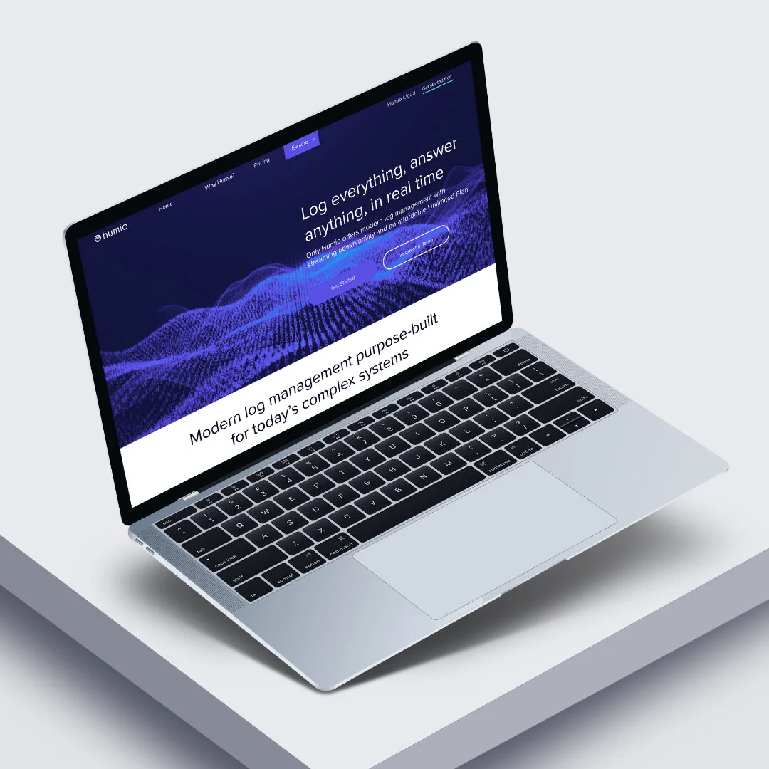
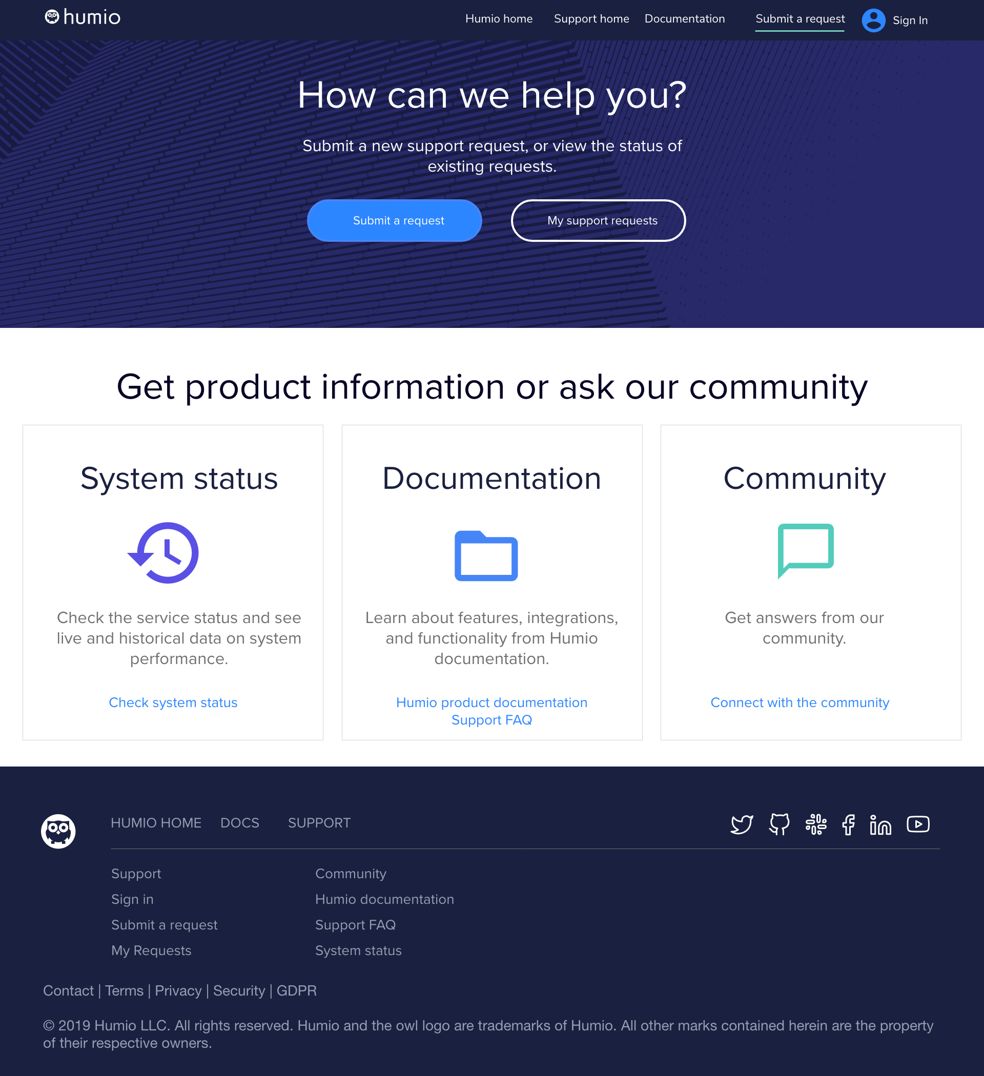
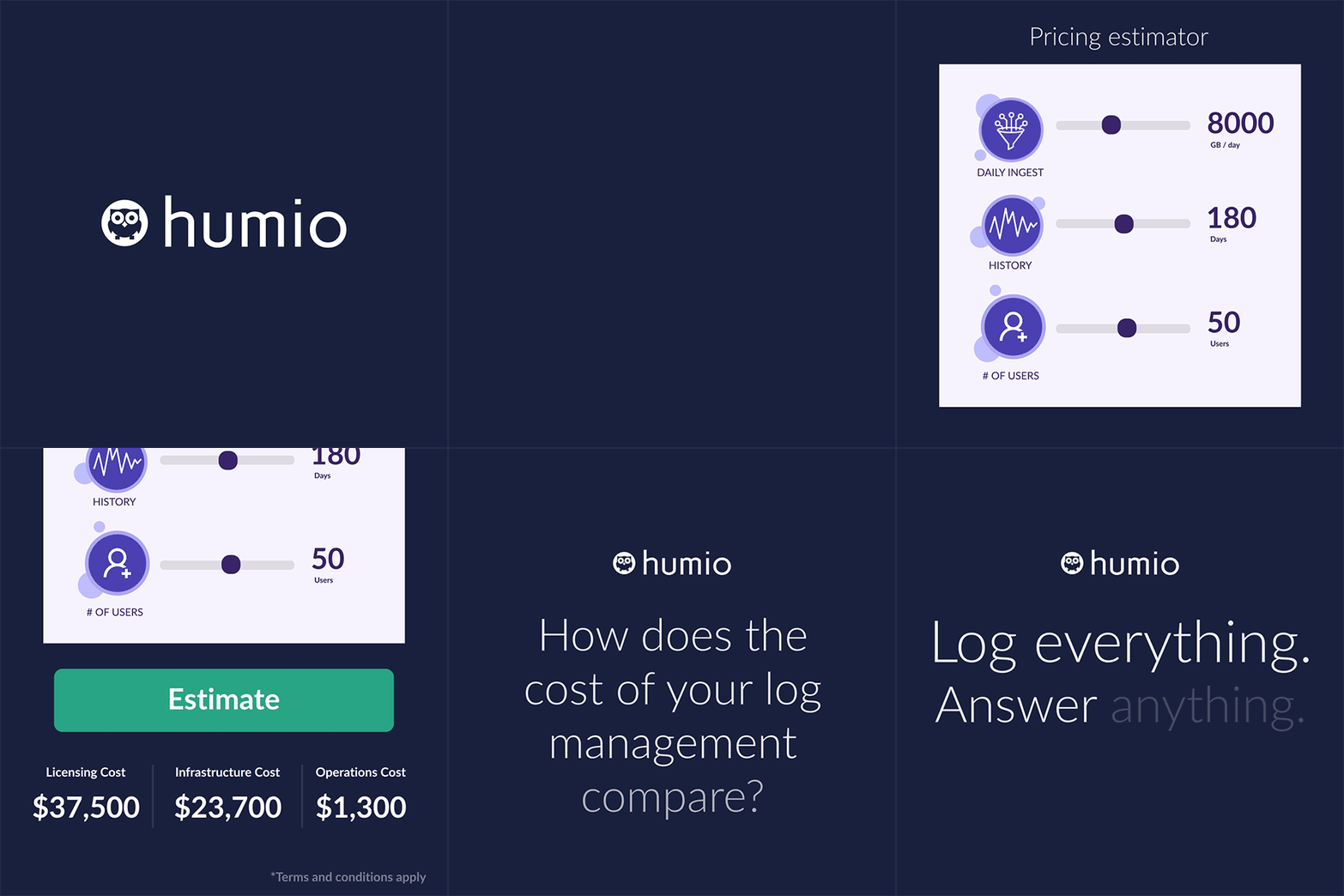
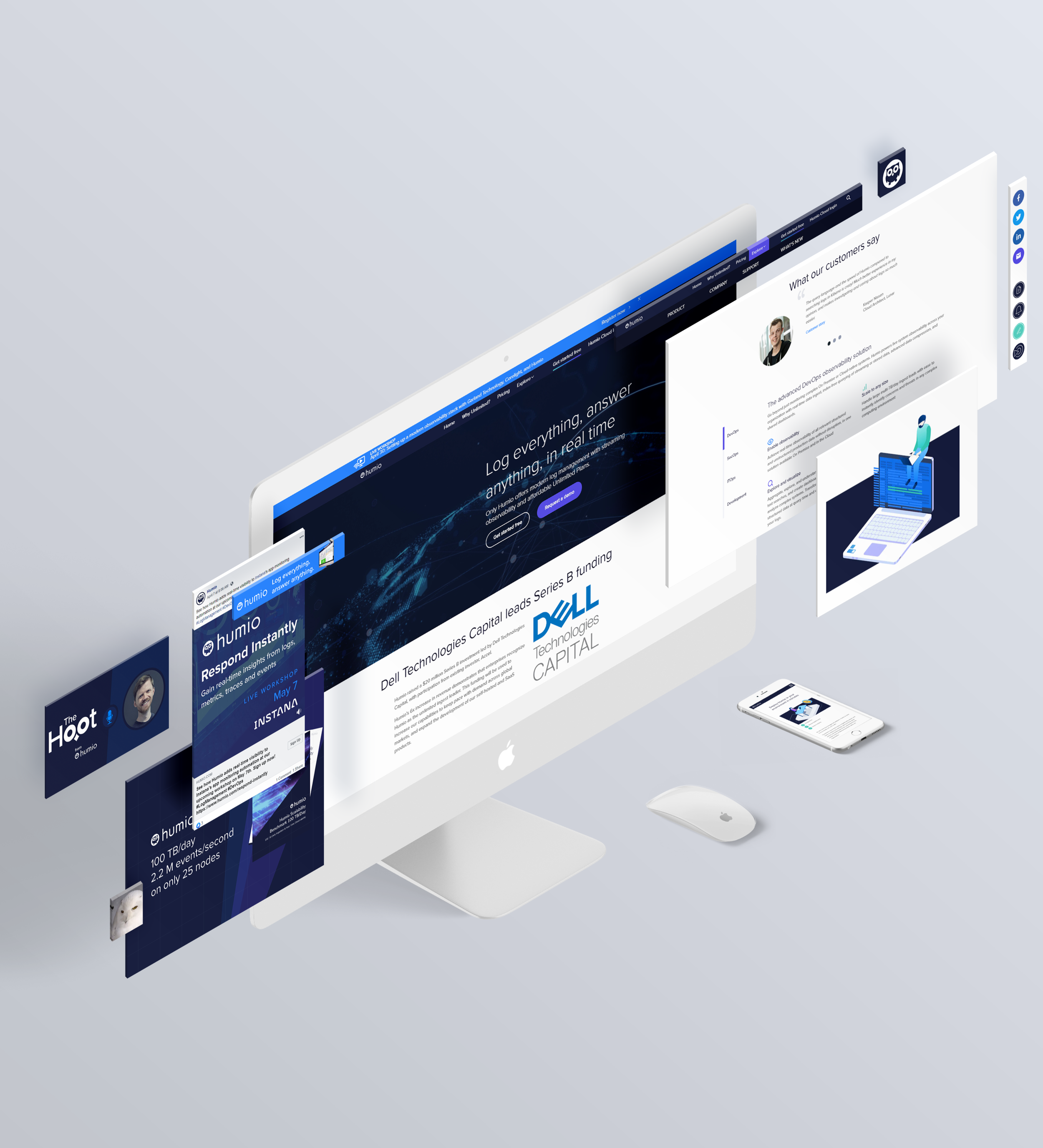
I re-designed the brand prioritizing the website which launched in under 2 months from the ground up exploding from a few pages of dated material to a massive site featuring blogs, podcasts, landing pages, product pages, deep dives and an estimate calculator driving qualified leads.
IA and Content Strategy
I worked very closely with the developer and content strategist to develop the information architecture for a complex mega menu and folder structure that would be easy to navigate for users and help drive natural search traffic through SEO.
Brand Strategy
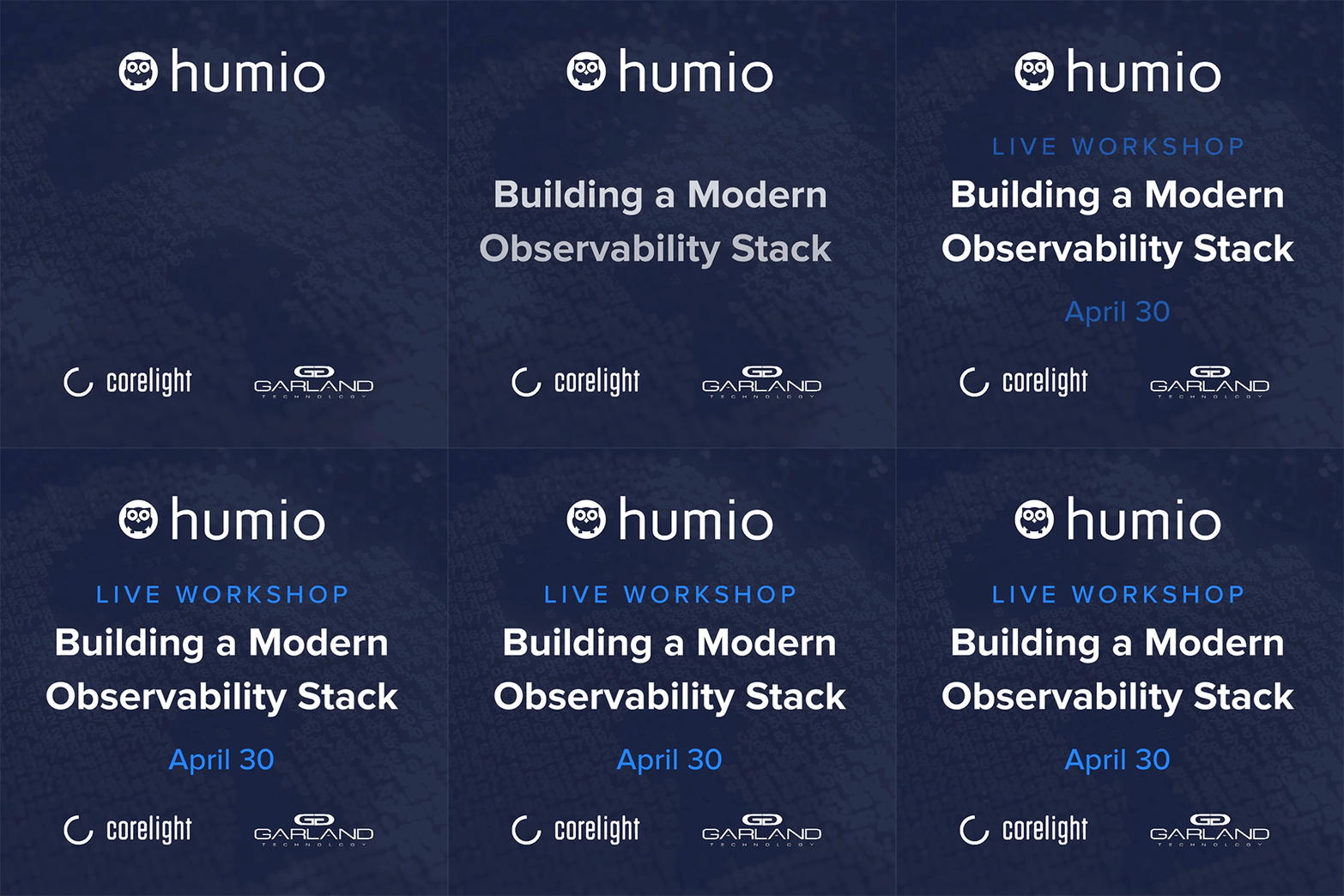
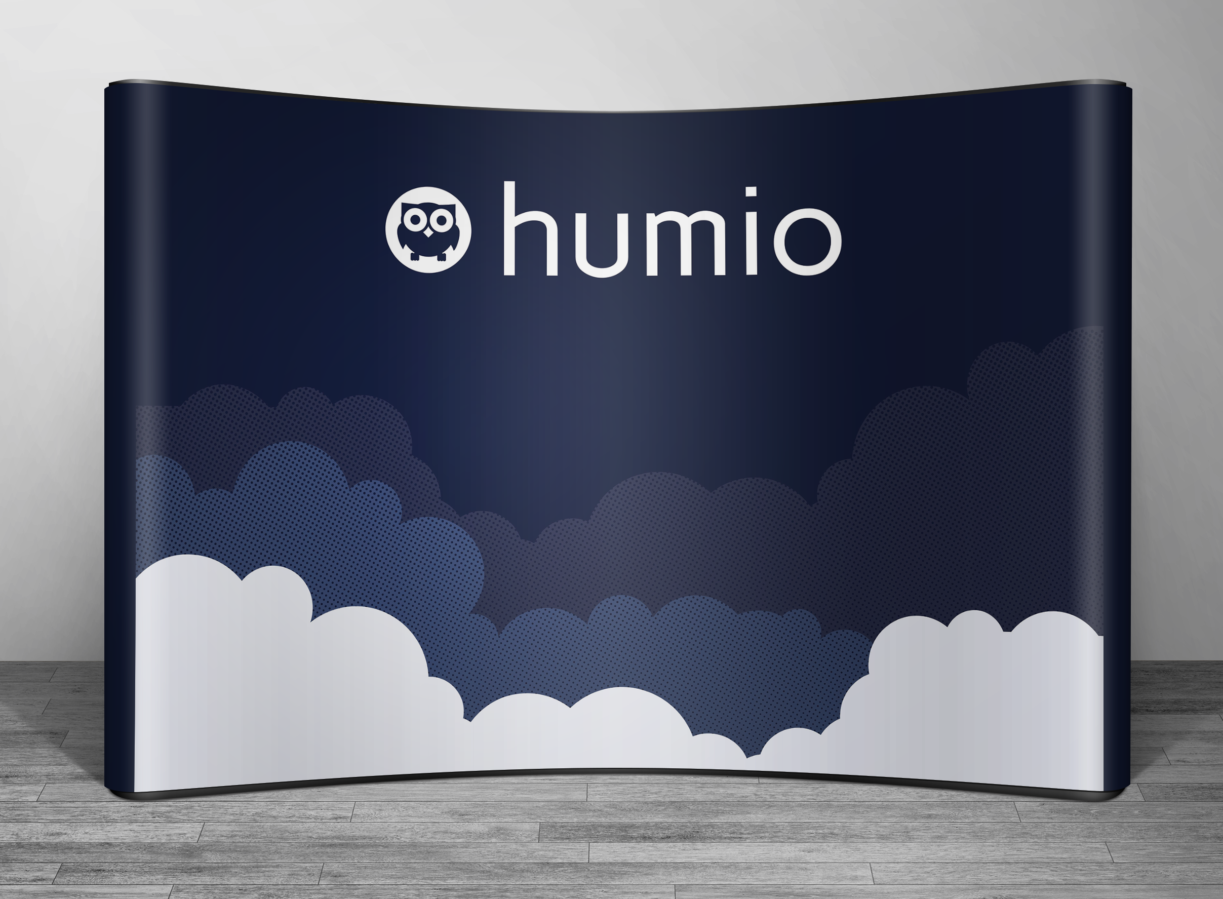
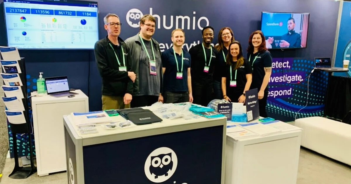
To convince the leadership their current brand needed an evolution I created a deck presenting other top brands that had moved toward a sleek simplicity to illustrate industry trends before showing them the new logo and website. While they clung to their historical visual mark of the owl, everything else was approved for a radical transformation from typography and colors to layout, icons, illustrations and more. I was able to set a clear and new direction for the brand to follow. I did the wireframing up to high fidelity prototypes as well as every piece of marketing collateral no matter how small from a Facebook banner ad to the layout and graphics for each and every page on the website.
Results
I had the support of a world class marketing team who brought record results and lead volume transforming into sales opportunities. We drove record lead volume, record webinar attendance and site traffic.
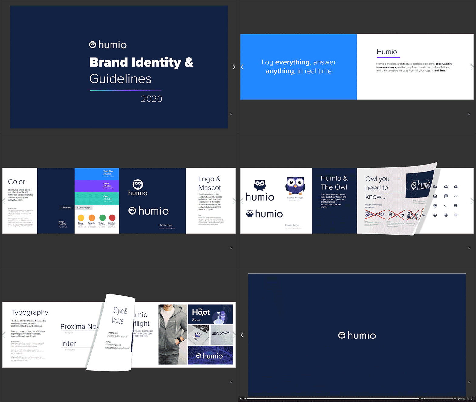
I developed a cohesive visual brand language and style guide. I forged the bond between marketing team and product design team to align brand visuals and bring synergy to the brand and product. I worked with the teams in Denmark and the UK across time zones to support the sales and marketing efforts around the globe.
I led project management of multiple video production projects with a video studio based in Denmark. I drove concepting, story boarding and the review cycles with the primary stakeholders as well as ensuring the visuals and tone of the music aligned with the Humio brand. I was also responsible for some video editing to put together videos for use on the website and social media.
I started at the company when they were at $9 million in Series A funding. We got incredible feedback about the brand transformation from potential investors as well as from tech partners like IBM who were blow away by the change. I was downsized from the company following a $20 million dollar series B funding at the beginning of the pandemic but they carried on with my brand vision past my departure and have just secured a $400 million dollar sale to CrowdStrike. I am so happy that the visual direction I set for the company could push them on a course toward incredible success, and I’m glad they were able to continue the original vision and evolve it to meet their goals.
The Work
UX/UI Design
Visual Design
Re-designing all pages on Humio.com
Lead Brand Design & collaborate with Product Design Dept
SWAG Design
Booth Design for Conferences
White-papers
Technical Briefs and Reports
Organic Social Media Creative
Paid Social Media
Display Advertisements
Motion Graphic Design
Video Editing
Email Template Creation
Landing Page Design
Information Architecture
Project Management
Creative A/B Testing
Re-branding
Style Guide Creation
Defined Color Palette
Iconography
Typography
Web Design
Presentation Design
Team Magenta
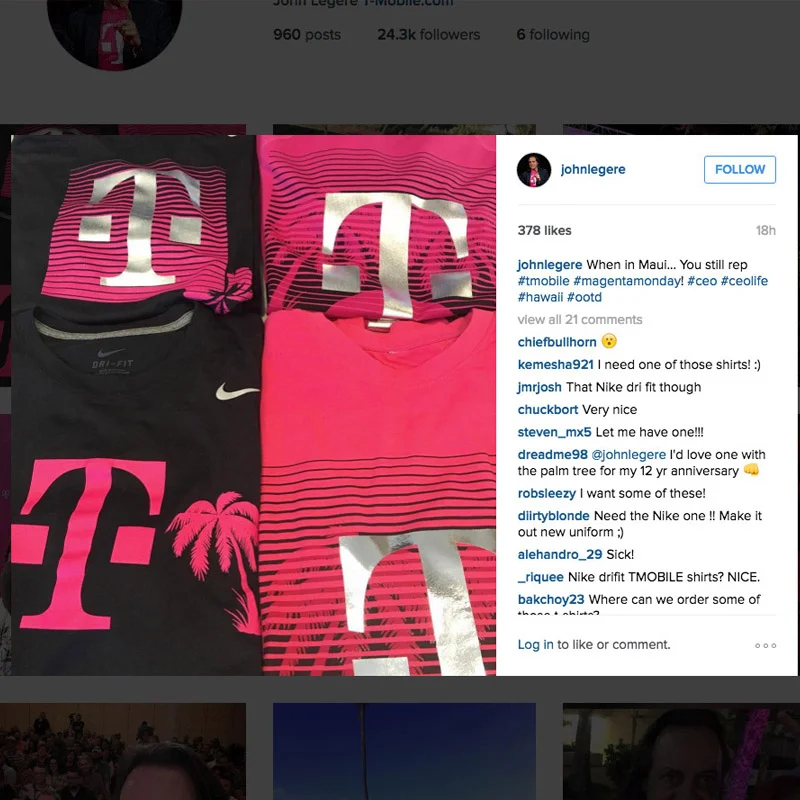
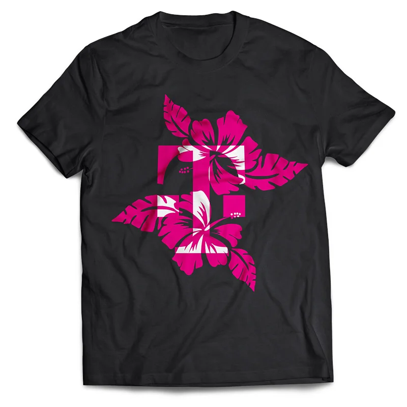
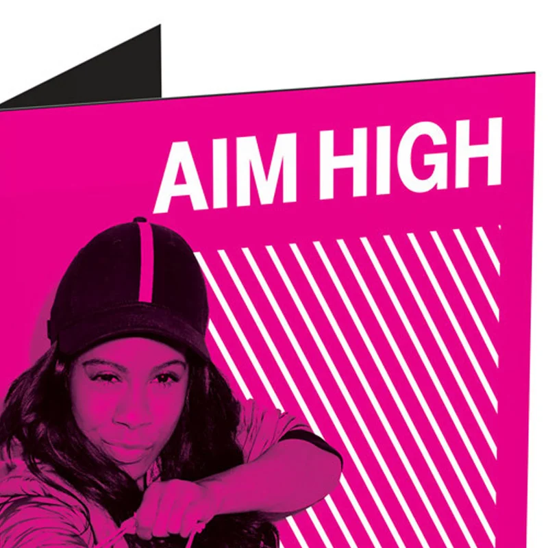
I worked internally in Corporate Communications Office of the CEO. Yes I got to see John Legere scooting around on his Segway mesmerizing employees at headquarters of T-Mobile. I even got to design some of his custom branded T-Shirts for PEAK in Hawaii. At T-Mobile I was a shepherd of the brand working to maintain its integrity.
The Work
Art Direction
Digital Marketing // Social
T-Shirt Design
Print Design // Posters
Pizza Boxes // Frosty Cups
Greeting Cards
Presentation Design
Infographics
Intranet
UX/UI Design
HTML/CSS Development
Supporting the Brand
How can you have an impact on a brand that is so established? Keep it intact and protect it from decay. Something truly unique about T-Mobile is the fact that the CEO had more twitter market share than all of the brand handles combined. His voice and the brand voice were becoming one and the same. He had figured out how to hack social media and continued to produce disruptive content emerging into new social spaces as the technology released.
I was able to work with his social media team directly and create artwork for his twitter handle. Even though there was an external PR agency that would handle a lot of this work - our team was often tapped because of the speed, quality and relentless attention to upholding the brand.
I got to design some highly unconventional things while at T-Mobile including custom pizza boxes for the launch of T-Mobile Tuesdays and Wendy’s Frosty cups. I even approved icing colors for cookies, because the brand was taken that seriously at every level. I did some digital marketing and print collateral for external campaigns, but primarily I was focused on internal communications.
We did presentation design and data visualization, including slides that would be broadcast at the quarterly business reviews. I did mockups for our time square takeover to help make business decisions surrounding our communications of the flagship store in New York. I worked closely with our internal PR team and at times the marketing team, filling in wherever needed. As an internal employee there were no creative briefs or project scopes, there were vague demands and high expectations. I learned to read minds and translate vague requests into impactful creative, building trust and becoming a go to resource.
Free Town Car with Hotel Booking
I collaboratively built this unique San Francisco start up’s brand from the ground up. The branding and product design were unique challenges.
The Work
Creative Direction
Branding
Logo Design // Business Cards
Design Language Development
Color Palette // Typography
Landing Page Design
UX (User Experience Design)
Designing Mobile and Tablet Experiences
Design for Customer App // Driver App
Business Owner and Client Dashboard
Wire-framing // Prototyping
Email Template Design
Email Template Litmus Testing and Coding
The Journey
I worked directly with the CEO as Creative Director and principal designer of the project. I started on the project during the early phases of conception and brought it to launch. Virgo Limo is a B2B business that enables hotels to provide free town car services for guests. Instead of guests booking an Uber from the airport or having shuttle transport them they would get a black town car equipped with wifi, leather seats and professional drivers. When I started on the project, some ground work had been laid but there was a lot of UX and branding challenges ahead to navigate.
App Design
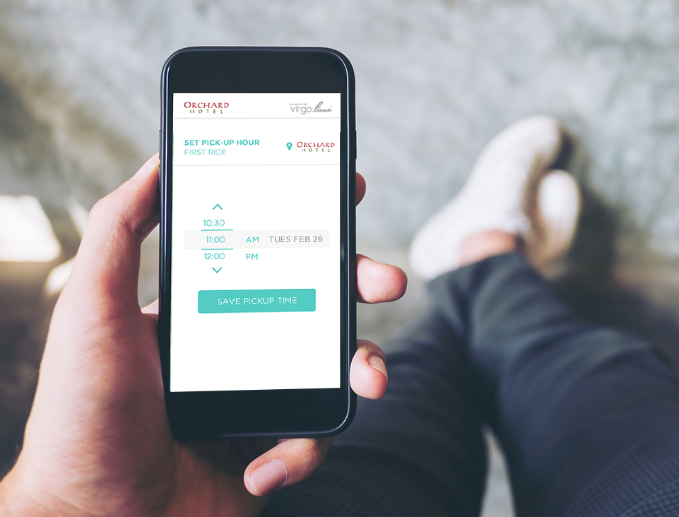
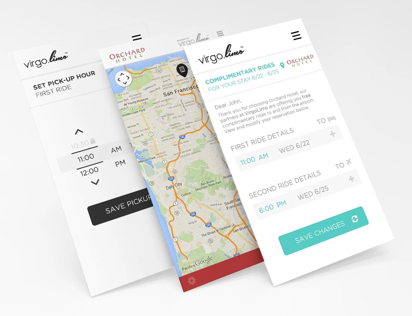
The first step for this project was jumping directly into the UX/UI of the app, which was in fact a web based application. Web based applications have some limitations such as not being able to rely on the OS for general UI functionality, for example date pickers, time sliders and other base level functionality. However this limitation also comes with a certain level of freedom because you are not restricted to one OS UI kit and you can create a cross platform application. As the designer, I was tasked with finding solutions for these functions that would be intuitive for users regardless of their preferred device. The app was already in development with a team in Romania getting the back end code to work, and it was my job to collaborate directly with them to develop the user experience, interface and create prototypes. Additionally, it was my responsibility to ensure the quality of the final product and maintain branding and visual standards. Because this was a web based application that guests would be using primarily on their phones in their mobile browser, there were some constraints that needed to be respected as we built out the experience.
Client App
The branding of the client app had unique requirements. It needed to be consistently branded powered by Virgo Limo, but it had to be a chameleon app that could adapt to the colors of any hotel that would wish to adopt it for their customers. The app had to be easily skinned at a moments notice to get a new hotel up and running with the service, so customers would feel like the booking was done directly through the hotel. The service had to feel like an amenity from the hotel and not a third party app. While developing the UI, I created a library of icons, buttons and menu conventions that were modern and consistent but could still blend into the branding of the hotels. I built minimalism and elegance into every component of my design so that it could be easy to use and easy to skin.
Driver App
The driver side app was for drivers to find the guest, and message them communicating delays and pick up details. The user experience needed to focus on the navigation and map aspect. The messaging platform needed to be minimal and easy to use, with simple common prompts to make it easy for the drivers to communicate and find guests. The driver side app was designed for tablets because each driver would receive a company tablet to use and integrate with the system.
The Business Dashboard
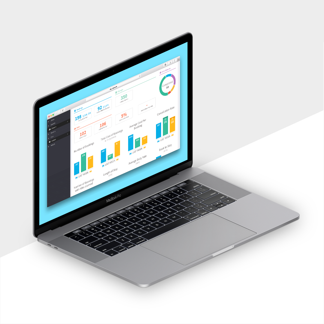
The dashboard for the business owners enabled them to monitor bookings, communication, drivers, schedules, the entire backbone of the business. The user experience challenge here was to make this gold mine of data and information visually digestible. Data visualization was a priority for this project. Colors, patterns and icons were used in a consistent visual language to make it easy to get a pulse on the business at a glance. The hotel dashboard was a simplified version of the business dashboard that would give hotels a view of how their new amenity was being used by guests and performing for their business.
Logo and Brand Language
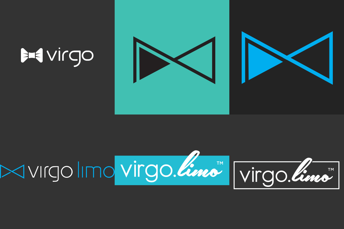
With the app design well under way, the next thing to tackle was the logo and style guide. The logo had to stand out and be visible on a moving vehicle from a distance. It could not imply taxi or ride-share but needed to pique interest. It also needed to be subtle and subdued and fit in the apps/ emails and ad experiences of the hotels providing the service to their customers. In this way it had to be both vibrant and subtle. This contradiction made brand development a fun challenge. I chose an electric blue for the primary brand color. A color that would stand out on the black cars providing the service but wouldn’t imply taxi. I then chose a modern sans serif and script combination of fonts for the logo developing a square and horizontal format that were balanced and subdued to blend in allowing the hotels’ brands to take center stage.
Integrity of Design
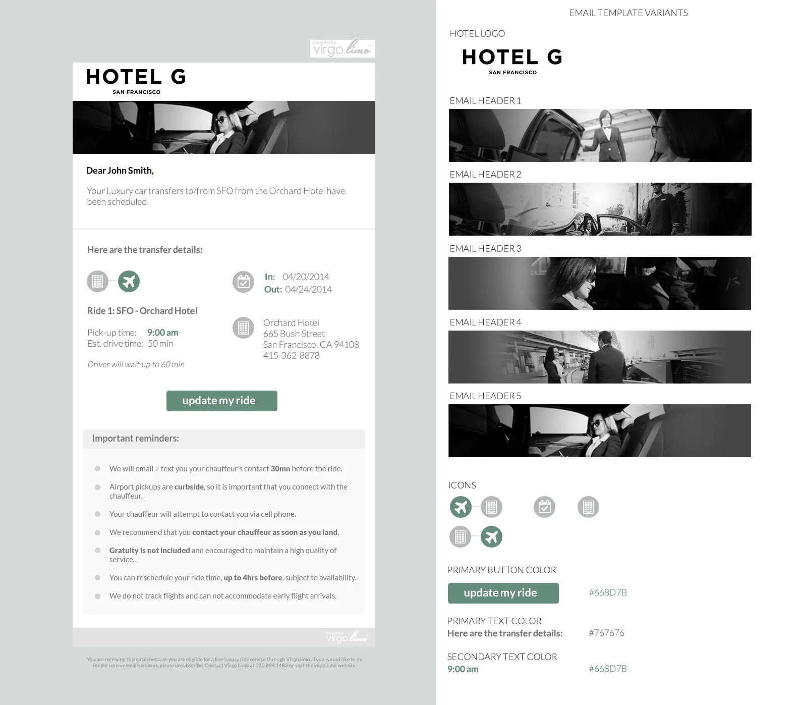
Though we had aggressive deadlines the stakes were high with a luxury brand and so our designs needed to be pixel perfect. I was on the phone many late nights working with the development team to ensure the integrity of the design work carried over to the live product. This is commonly a point of contention between designers and developers because design fidelity can mean more dev hours. Because I am a developer too, I have a deep empathy and understanding of level of effort associated with design challenges. I know what it takes to code solutions, and I get my hands dirty from time to time to provide solutions through code. For the email templates I hand coded the core template to ensure quality code and a gracefully degrading design for legacy ISPs as I was very familiar with email HTML. The development team welcomed my additional aid in a stressful time pre-launch and we worked very well together despite the pressure of the aggressive timelines, scope creep and language barriers.
User Experience
One of the most unique aspects of this project was the user experience. This UX for the guests would impact the business as a whole and quickly after launch we discovered some problem areas we were able to resolve, and make significant positive impact. The guests would book their ride to the hotel through the hotel, often through a link in the confirmation email of their room reservation. This created a somewhat unforeseen issue. When guests made their room booking it could be months in advance. At that time they were not ready to schedule a ride to the hotel and so they would simply ignore the offer. Because they hadn’t confirmed the need for the ride, the business was not expecting the volume of requests. The guests would book last minute at great cost to Virgo Limo which was providing the drivers. So we found a solution: we interrupted the guest experience by offering an option to reserve the ride without booking a time. There would be an email drip campaign setback from the time of their booking to remind them to change their hold to a scheduled reservation. This real time user experience problem solving has been a big part of the work I’ve done throughout my career centered around user behavioral studies and testing to ensure the optimal user experience.
From wire-framing to high fidelity prototypes and live product design I was there at every step of the process, owning design from end to end.
Performance Cycling
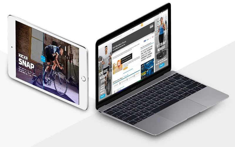
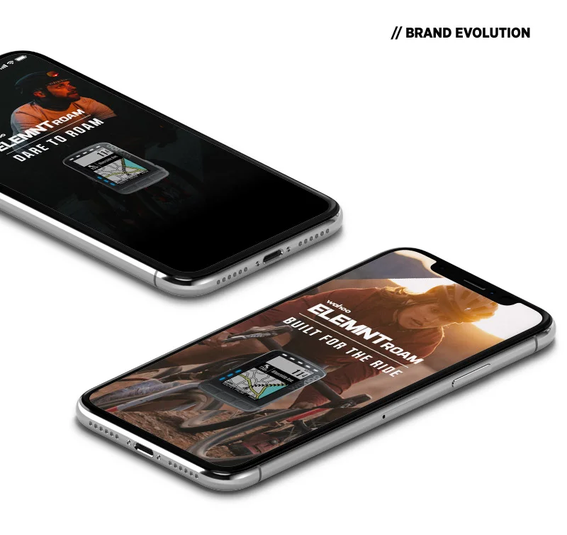
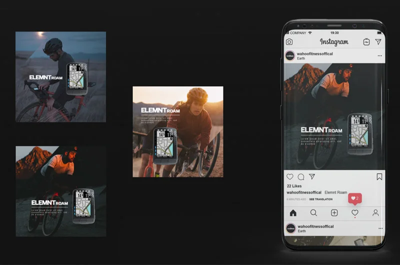
I have had the pleasure of working with this unique brand in the cycling world for several years through Add3, a digital marketing agency in Seattle. Wahoo may not be a household name for everyone but in the cycling world they have a prominent presence as one of the leaders in indoor training. Several professional teams and athletes use their gear to train for everything from Iron Man races to the Tour de France. Wahoo has an agency of record from Portland that handles the branding but our team shepherded the brand from a safe and minimal space to a boundary pushing brand with compelling social media content and record breaking advertising.
The Work
Creative Direction
Brand Evolution
Motion Graphic Design
Creative Direction for Custom Illustrations
Creative Direction for Custom Animations
User Experience Design
Landing Page Design
Sales Experience Design
Social Media Marketing Collateral
Display Banners
Spotify Playlist Creative
Video Editing
Skins and Takeovers
Brand Evolution
Wahoo liked to play it really safe when I first started on the account. From their stark, gritty photography taken in the same basement studio to the stark monochromatic compositions on a lot of their pieces they were playing in familiar territory. I remember distinctly trying to get a splash of color added to the photos in a gradient overlay for our Spotify playlists curated based on professional athletes as the color grading was popular on Spotify. This was an uphill battle at first because as another agency working on the brand they had worked hard to forge, we needed to earn something very important first. Trust.
Leading the Design Team
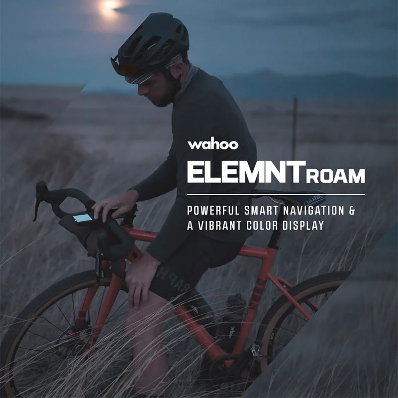
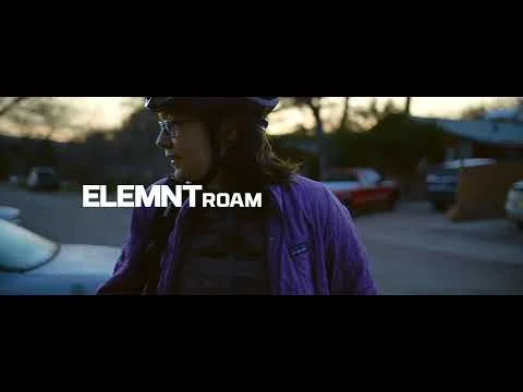
After a couple of years, some long email threads and phone calls - we’ve earned that trust. The trust came from the hard work, consistent goal crushing performance and listening to the clients wants and needs. I led a small design team with a combination of full time employees and contractors to create some beautiful, compelling work. Some of our best work I was so proud to have not touched a pixel of. I merely mentored and coached our designers to lead the charge and produce their best work. I helped refine the work through constructive feedback. My leadership style is that of collaboration, coaching and inspiring. I strongly believe that creative people have a potential that you can only unlock if you give them time, space and encouragement to unleash a creative potential beyond your expectations. If you define every creative decision, every thought and reduce the creative process to decoupage then you aren’t tapping the full potential of your design team. To give a shout out Patrick Snapp, senior designer was a true leader producing the beautiful designs toward the bottom of the page for the ROAM launch. His work is phenomenal and I’m immensely proud of it.
Performance
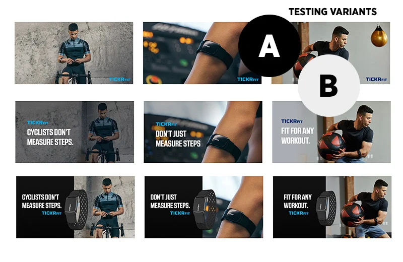
Some agencies put out creative that looks good in a boardroom, can be talked about for about a week, seemingly make a splash but falls flat for sales. This is not the case for the work I proudly championed on the Wahoo account. We were able to drive consistent performance through constant testing and evolving the creative to change as rapidly as the attention spans of social media audiences.
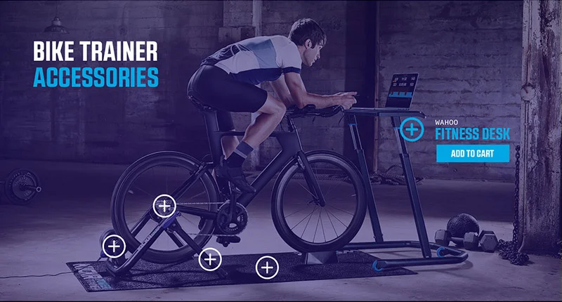
I provided the strategic direction, wire frames, visual design direction for our holiday campaigns which resulted in goal crushing results. This sales experience I developed on the website was optimized for organic and paid traffic and brought a significant increase in sales year over year. Beyond holiday campaigns, since my team started developing the digital marketing collateral partnering with the media managers we saw increases in sales year over year. We were able to determine a winning creative layout, and increase overall marketing budgets because of the increase in efficiency of the marketing efforts on the whole.
We created unique ads, including instant experience ads that told immersive stories about the products and featured unique content like user generated video. We saw up to 26X Return on Ad Spend (ROAS) with some of our ads and our custom designed holiday sales experience drove millions in sales, significantly more than previous years. We approached every design with both an aesthetic and performance driven eye. We optimized the creative to ensure engagement and conversions.
As the Creative Director at Add3 I worked with many different clients including multiple departments from Amazon. Amazon Video, Amazon Launchpad, Amazon Teen, Lockers, Household and many more…
Amazon Teen
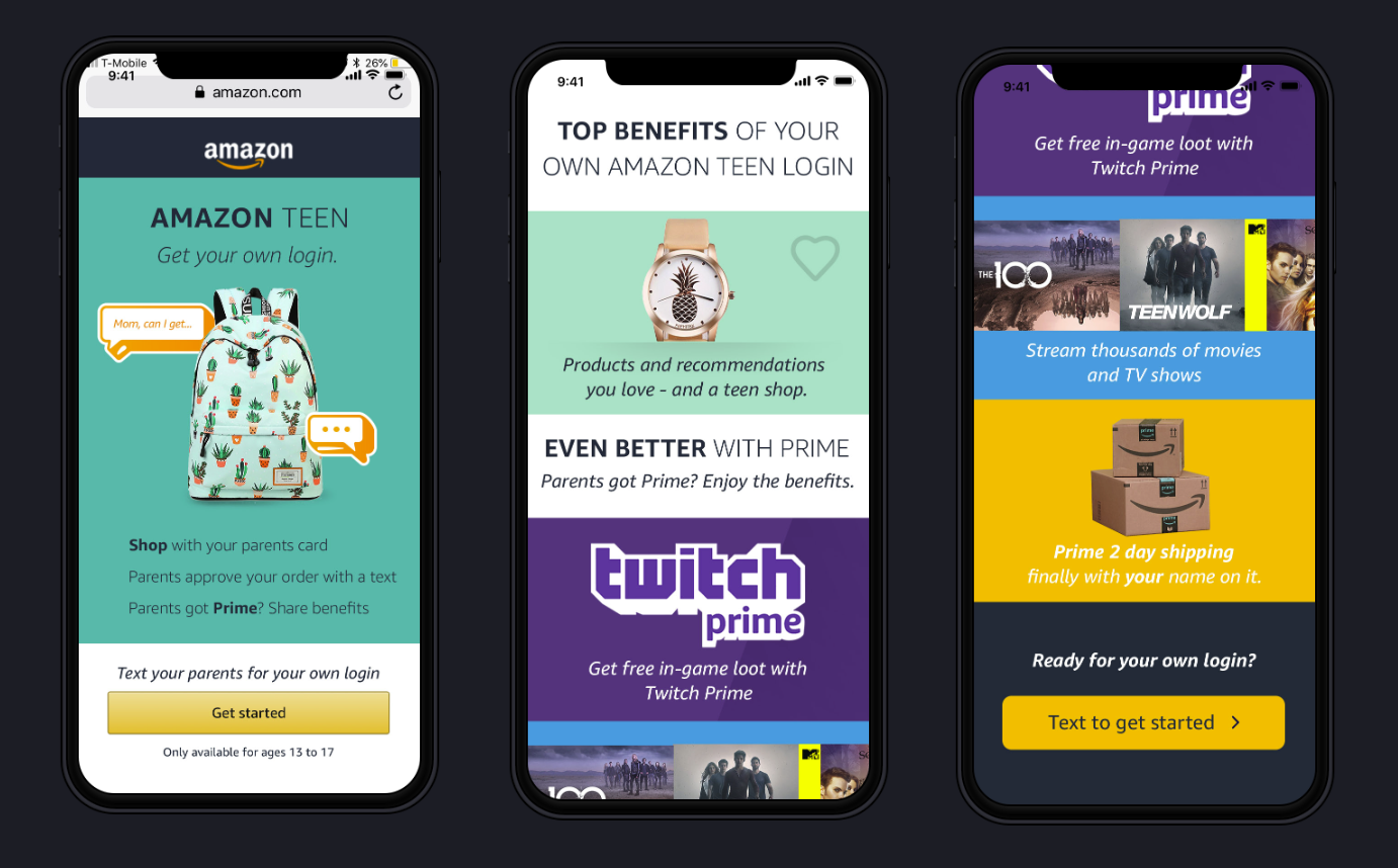
For Amazon Teen we had the unique challenge of creating campaigns that would be compelling for teens and parents leaving a market impact and introducing them to the new program where teens could have their own Amazon Account.
Based on our research the vast majority of users were on mobile so we took a mobile first approach creating social media campaigns that would drive to a mobile optimized sign up experience.
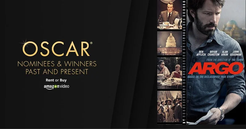
Amazon Video
Amazon Prime was becoming more and more popular and Add3 was challenged with differentiating the prime streaming services from the rent or buy offering. Because of strong competitors like Apple and Google Play and the challenging user experience of purchasing digital content on mobile this was a tall order. As the Creative Director I worked closely with the senior copywriter to tell a story that clearly highlighted the key benefits of Amazon Video.
The Work
Creative Direction
Social Media Ads
Carousels
Canvas Ads
Video Editing
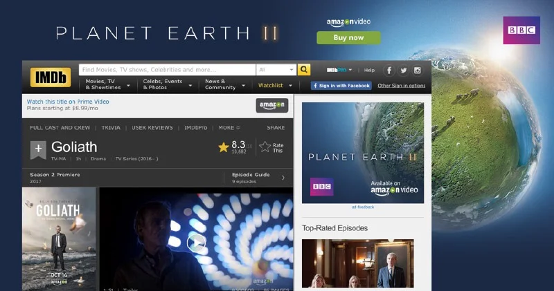
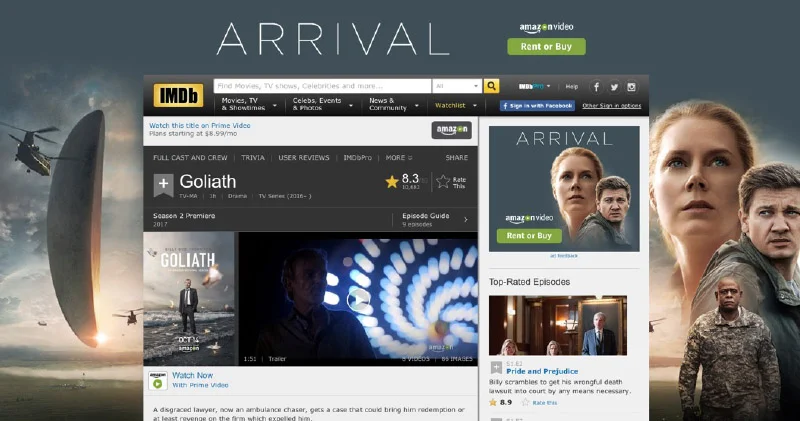
IMDB Takeovers
Data Driven Messaging
The primary challenge presented on this account was to create awareness and spend the advertising budget efficiently while testing and discovering the message that resonated best with audiences. The Add3 team is very performance driven so the account managers and analysts came up with a testing plan using a chi-square analysis to come to statistical significance with greater budget efficiency. This meant that the copywriter and I were busy building permutations of ads with visual representation of the audience segments and messaging that highlighted the primary value propositions. We were successful in our testing but the messaging alone was not compelling enough for dynamic channels like social. This is where we coupled our winning messaging with the latest new releases to draw attention and drive better ad performance.
Go to Market
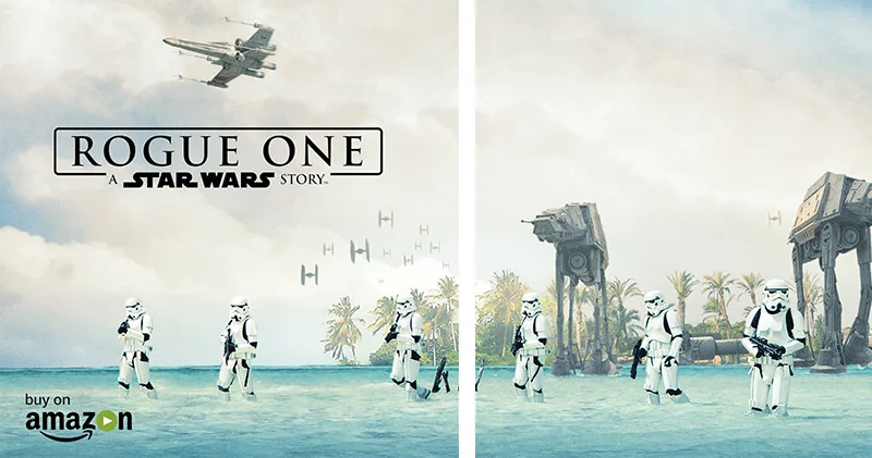
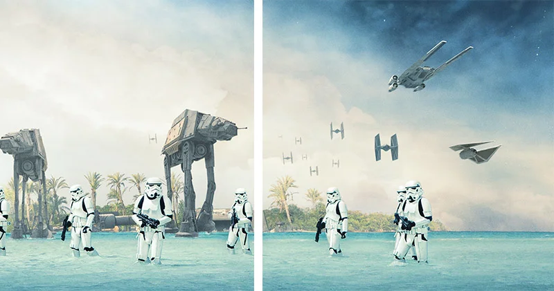
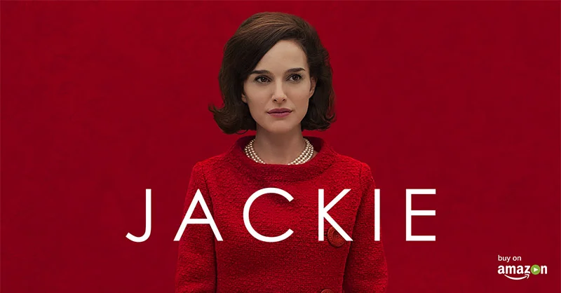
After our testing had concluded the Amazon Video team continued to lean on our team heavily for releases of films especially when there needed to be a creative execution with the studio assets and approval through strict studios like Disney. Our team was careful to respect the source material while pushing the boundaries of the channel and ad types. Our Star Wars Rogue One launch for Amazon Video garnered attention in the US and UK with our unique 360 organic posts coupled with our panoramic carousels. The speed and quality was especially important to hit key release dates as even a half day delay could significantly impact campaign performance. Our responsiveness and success record caused us to build such trust with the core Amazon team that these people went on to give us many referrals for future business. The clients have even specifically requested me by name over the years because of the continued quality of work.
Cosmetic Treatments
RealSelf offers a unique experience for people to learn more about cosmetic treatments. RealSelf approached our agency after a recent rebranding in order to develop a social media marketing strategy and channel optimized creative.
Creative Direction
Brand Evolution // Ads
Social Media Marketing
Canvas Ads
Photo Library Curation
UX/UI Recommendations
Data Driven Design
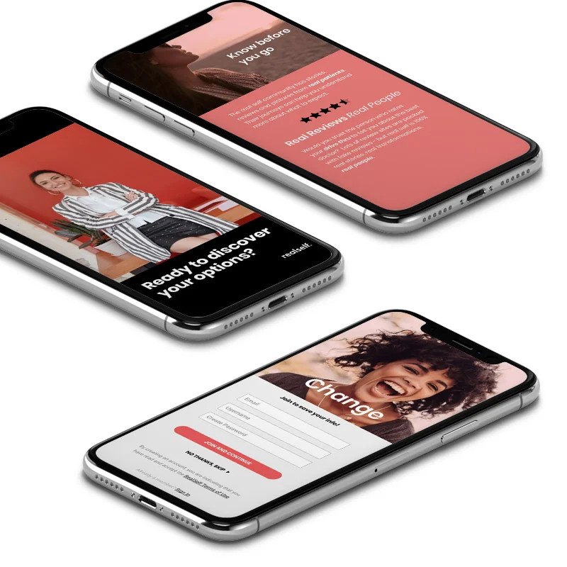
It can be nerve racking to go through a re-branding especially when it transforms your website. When Real Self approached Add3, they were looking to leverage the new brand on social and make some website optimizations to ensure the new site would be successful at driving quality leads to their business partners.
First we tackled the social media marketing because lead volume was a priority. With the new branding they had proposed, we ran into some ambiguity with messaging and imagery that was negatively impacting performance.
Our agency proposed a canvas ad experience (now known as Facebook/Instagram instant experiences). This is an immersive ad type which creates an opportunity to build a mini optimized landing page experience harnessing phone capacities in the UX like tilt to pan to create interactive, immersive, story telling.
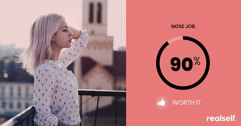
Our agency was lucky enough to receive a full, comprehensive study the brand had done to understand more about their market, the percentages behind popular procedures and the motivations driving those decisions. Our design team used this data to frame the story, focusing on popular procedures and motivations in the messaging. The imagery was purposefully chosen to represent the primary demographic for that procedure. The value propositions were highlighted in an approachable way and the ad format made the story easy to understand.
Providing our insights and expertise to the brand had a significant impact on the efficiency of their campaigns.
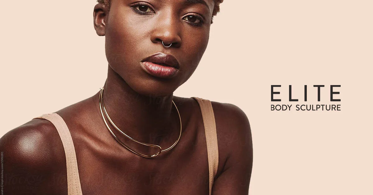
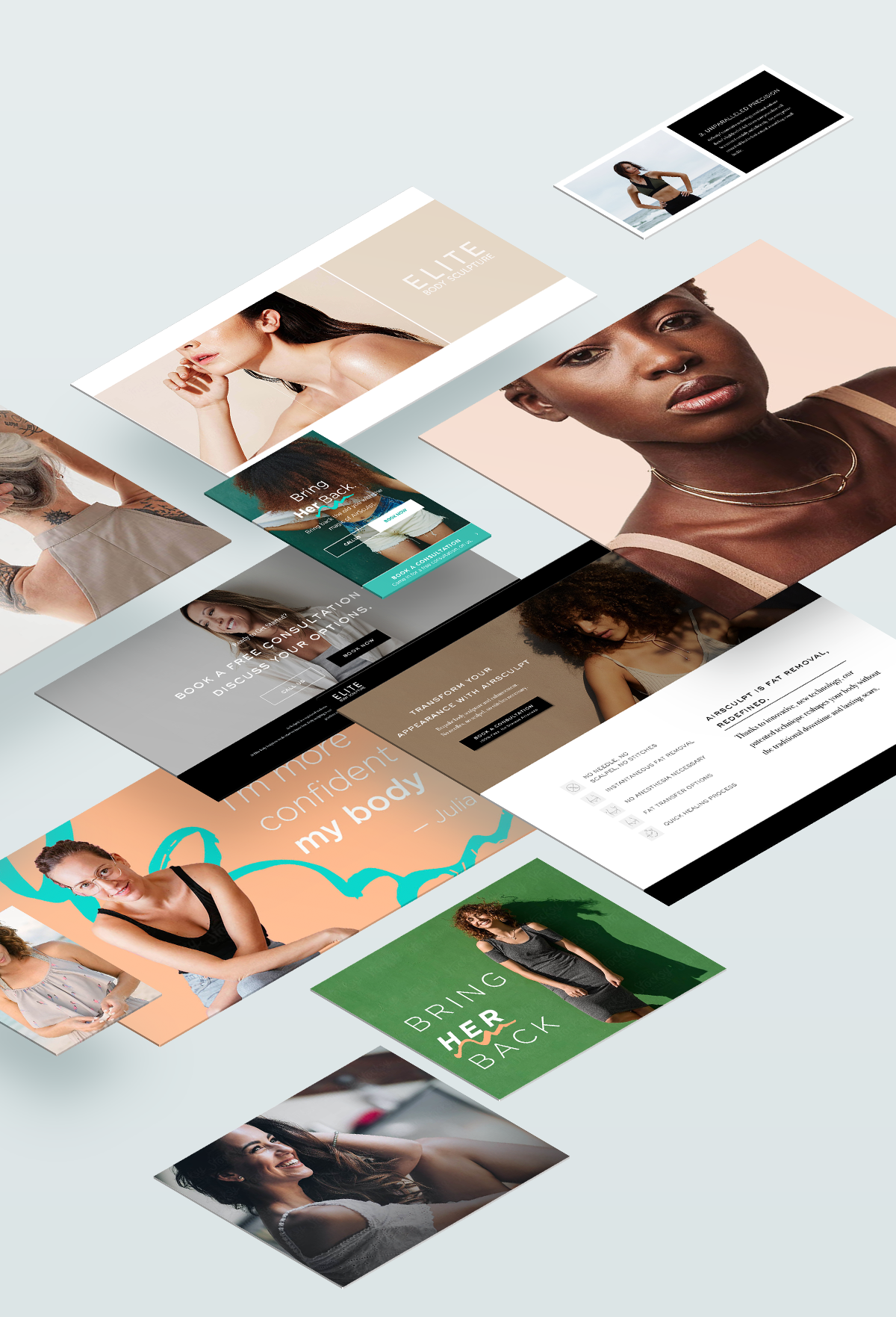
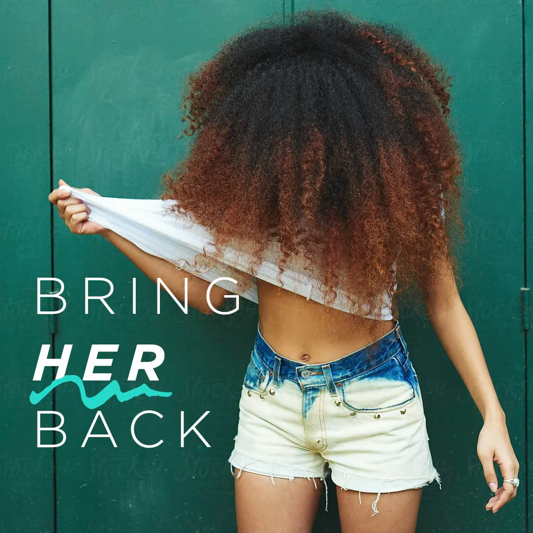
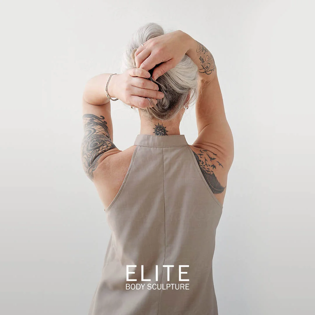
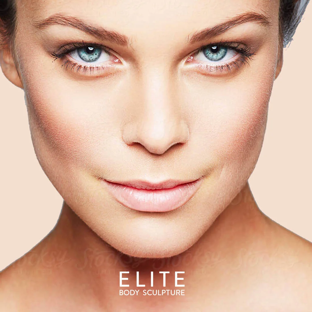
Elite Body Sculpture is high end body sculpting business with locations around the US. They were in need of a brand makeover as their previous branding made them feel inexpensive and dated. Considering their business was founded on latest advancements in body sculpting it was critical that the new branding reflect a modern elegance.
The Work
Creative Direction
Landing Page Design
Photo Selection
Branding
UX/UI Design
For this project our agency proposed 5 very different directions for the client as they wanted to see a multitude of possibilities before deciding on their defining brand direction. I proposed multiple styles as an individual contributor but my Sr Designer Patrick’s design was selected by the client. This was really great to see my team members work get recognition.
Once the client had selected a direction, I guided the meetings surrounding the approval process and made all of the necessary changes to reach client satisfaction. I worked with the agencies Content Strategist to ensure the messaging and visuals were aligned. A lot of the initial photography needed to be re-imagined and re-worked to get to a final result. I packed all of the files for the remote development team and troubleshooted issues as we prepared for launch.
User Experience
User Experience Design
User Interface Design
Product Design
Website Design
Visual Design
Responsive Design
Native iOS and Android App Design
Defining Personas
Journey Mapping
Wire-framing
Low Fidelity Prototypes
High Fidelity Prototypes
Collaborates Seamlessly with Developers
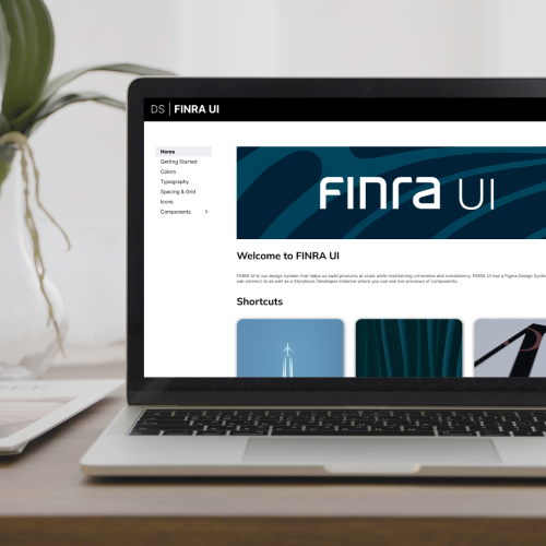
Design Systems
Advanced Figma Skills
Designs Systems Build & Governance
Nested Components
Figma Library Management
Branching and Reviewing Branches
Dark Mode & Light Mode Support
User Research
User Testing
Moderated & Un-moderated
User Interviews
Card Sorting
Analysis
Accessibility
Accessibility Design
WCAG
Contrast Checking
Tabbed Navigation
ARIA Labels
Dark Mode/ Light Mode
Branding
Creative Direction
Logo Design
Color Palette Creation
Development of a Design Language
Business Cards
Style Guide Development
Visual Asset Creation
Photo Direction
Presentation Design
Website Design
Optimization
Conversion Rate Optimization (CRO)
Digital Marketing Experience
A/B Testing
Heat-mapping
User Behavioral Analysis
Tools & Languages
Figma
Adobe Creative Suite
Sketch
Miro
JIRA
Basecamp
Asana
Monday.com
InVision
UX Pin
HTML/CSS
JavaScript
PHP
Microsoft Office
Motion & Video
Motion Graphic Design
Interaction Design
Video Editing
Accessibility
Animated Gifs
Animated Social Media Stickers
Animated Banner Ads
Immersive Ad Experiences
Intros
Outros
Lower thirds
Collateral
User Interfaces
Websites
Landing Pages
Mobile Ads
Display Ads
Story Ads
Instant Experiences/ Canvas
Print Ads
Out of Home
Posters
Billboards
Booth Design
SWAG Design
Letterheads
Presentation Decks
Reports
White Papers
E-books
Custom Icons
Email template design
Email coding
Landing page design
Landing page coding